Subscribe by email

2022/06/01

A Hénon Map Inspired by an Artwork Inspired by a Hénon map

As part of my maths in museums work I was talking to someone at the National Galleries of Scotland. The world of art lies a little outside my comfort zone, which is partly why I was interested in talking to them: if I want to encourage other people to venture outside their comfort zones in the direction of mathematics I should probably practice what I preach.

Anyway, just outside the Modern One gallery there is a sculpted land feature created by artist Charles Jencks called Landform which you can see to the top-right of the embedded satellite view of the area below:

The sweeping curves and other-worldly, natural-but-not-quite feel to this formation reminded me of something, but I couldn't immediately remember what. Somewhere in the back of my mind, Jeff Goldblum popped up:

2022/02/01

Interactive Chart: Diagram Showing the Numbers Living and Dead at the Several Ages from 20 - 40

The activity below is the last of four produced for the University of Nottingham's Florence Nightingale Comes Home project. Relatively succinctly (if morbidly) titled, Diagram Showing the Numbers Living and Dead at the Several Ages from 20 - 40 consists of three charts, each considering how many people out of a starting value of 10,000 have died by the time they reach particular ages, in a particular category. These categories are English soldiers, Englishmen, and Englishmen in healthy districts.

Interactive Chart: Diagrams Constructed on the Data Furnished by the Quarter Master General's Plans for Encampment

The activity below is the third of four produced for the University of Nottingham's Florence Nightingale Comes Home project. Less unwieldy than some of her other titles, Diagrams Constructed on the Data Furnished by the Quarter Master General's Plans for Encampment compares the population density of planned military encampments with those experienced in London.

There are two slides in the activity above: the first provides the data that Florence Nightingale was provided with, and an encouragement to think about how you might present this, either to understand it better yourself or to make a point to someone else. The second slide shows what she actually did with the data. How does it compare with what you thought on the first slide? Does it help you to understand the information better? What point do you think she was trying to make by choosing to represent it in this way?

Nightingale is known very well as "the Lady with the Lamp," but her contributions to mathematics are something that many people are unfortunately unaware of. She changed the face of (and attitudes towards) data visualisation in the UK, using easily understood visuals to tell the stories embedded in data that was otherwise unreadable to non-mathematicians, including politicians and royalty.

You can find the full collection of classroom resources for the Florence Nightingale at Home project at the link below:

Nightingale Classroom Resources

Want to learn more about data visualisation in statistics? Try this free course from Alison.

Interactive Chart: Diagram Representing the Mortality in the Hospitals at Scutari and Kulali, from Oct 1st 1854 to Sept 20th 1855

The activity below is the second of four produced for the University of Nottingham's Florence Nightingale Comes Home project. With another mouthful of a title, Diagram Representing the Mortality in the Hospitals at Scutari and Kulali, from Oct 1st 1854 to Sept 20th 1855 looks at death rates in Crimean military hospitals, comparing them to annual average death rates in London military hospitals for the same period.

This is a Polar Area Chart, which isn't something that comes up a lot in school maths classrooms, but there are some interesting comparisons with Pie Charts (and even Histograms) to be noticed. There's also an opportunity for discussion on the purpose of percentages, if you look closely!

Nightingale is known very well as "the Lady with the Lamp," but her contributions to mathematics are something that many people are unfortunately unaware of. She changed the face of (and attitudes towards) data visualisation in the UK, using easily understood visuals to tell the stories embedded in data that was otherwise unreadable to non-mathematicians, including politicians and royalty.

You can find the full collection of classroom resources for the Florence Nightingale at Home project at the link below:

Nightingale Classroom Resources

Want to learn more about data visualisation in statistics? Try this free course from Alison.

Interactive Chart: Representing the Relative Mortality of the Army at Home and of the English Male Population at Corresponding Ages

The activity below is the first of four produced for the University of Nottingham's Florence Nightingale Comes Home project. This one delves into Nightingale's not-so-snappily-titled Representing the Relative Mortality of the Army at Home and of the English Male Population at Corresponding Ages chart in which she compares data regarding mortality (death rates) amongst the general (male) British population for different age groups with the same data for men in the British Army.

You can see that deaths for those in the army are considerably higher than deaths for those who are not in the army, and you'd be forgiven for thinking this might be expected until you realise that this is not during a period of war and fighting: these individuals are living in army barracks in the UK in peacetime, and Nightingale's visualisation is intended to highlight the fact that they are dying in much greater numbers than should be expected. This was just one of many charts she devised to bring the desperate need for better living conditions for soldiers of the time to the attention of people who were in a position to do something about it.

Nightingale is known very well as "the Lady with the Lamp," but her contributions to mathematics are something that many people are unfortunately unaware of. She changed the face of (and attitudes towards) data visualisation in the UK, using easily understood visuals to tell the stories embedded in data that was otherwise unreadable to non-mathematicians, including politicians and royalty.

You can find the full collection of classroom resources for the Florence Nightingale at Home project at the link below:

Nightingale Classroom Resources

Want to learn more about data visualisation in statistics? Try this free course from Alison.

2022/01/22

Buildings Based on Mathematics

All buildings, as this fascinating article from the maths careers website reminds us, are built using mathematics. There are a number of astonishing buildings around the world, however, which display some of the beauty of mathematics for all to see. The article linked to below includes, for example, this spiral tower in Denmark:

Altogether, twelve very different architectural constructions are represented in the article, in locations as far apart as China, Italy, and a tiny service station off the A1 a bit south of Doncaster.

Buildings Based on Mathematics

Want to learn more about geometry? Try this free course from Alison.

2021/12/20

Maths at the Movies: Predicting Income

In two years (so far) of pandemic responses many business in many sectors have suffered. Just one of these is the movie industry, with cinemas now trying to recoup revenue lost during long periods of closure and reduced patronage.

Hollywood Theatre (1935) Entrance by Heritage Vancouver/Patrick Gunn is licenced under CC BY-NC-ND 2.0

The article linked below, posted by the Institute of Mathematics and its Applications (IMA), briefly introduces four methods for modelling the performance of past movies at the box office with a view to predicting future income. As with most explorations of mathematical topics, the principles covered here could be applied to different situations in other industries.

Could Mathematics Be Big at the Box Office?

Want to learn more about differential equations? Try this free course from Alison.

2021/12/18

The Man Who Knew Infinity - Maths in the Movies

The Man Who Knew Infinity (DVD):
amzn.to/3mCIljh

At the time of writing The Man Who Knew Infinity is available to watch on BBC iPlayer, or it can be bought or rented via Amazon Prime Video.

The Man Who Knew Infinity is a biographical drama about real-life Indian Mathematician Srinivasa Ramanujan, who made a number of contributions to pure mathematics during his relatively short life. The movie focuses on his work with English Mathematician G. H. Hardy at Cambridge University following a postal correspondence that convinced Hardy of Ramanujan's brilliance.

2021/12/14

Every GCHQ Christmas Card

For the past few years (with some gaps) GCHQ have released a very special card at Christmas. Not just a device for wishing recipients the best of the season, it includes puzzles to solve! These are usually presented as a series of brainteasers of increasing difficulty, with the early stages usually pretty accessible, and the later ones a bit more challenging.

Here are links to each one so far, with a preview of each:

2021

GCHQ's 2021 Christmas Card - Preview


2021/12/12

The Allusionist: Num8er5

The Allusionist is a podcast focusing on language, and this episode, Num8er5, is all about, well, numbers. You can listen to it in the player below, or read more information (including a link to its page at the Allusionist) underneath that.

The episode compares the development and use of numbers as expressed verbally with numeral systems for writing them down. It provides an interesting thread through aspects of history that are relevant to both language and mathematics, and touches upon number use across different societies, cultures and civilisations throughout history. Click the link below to listen to the episode on The Allusionist's website, where there is further information and links to related resources including other episodes.

The Allusionist: Num8er5

2021/12/01

Maths is Forever

One of a collection of posters produced for World Year of Mathematics 2000 and displayed on trains in the London Underground, this one focuses on the Twelve Days of Christmas, with a quick nod to proof.

This is a low-res version. Download the full-sized image at the link below:

2021/11/17

Mathematical Objects: Enigma Machine

Shortly before leaving Bletchley Park I guested on the Aperiodical's Mathematical Objects podcast talking about Enigma machines. Listen to this episode in the player below:

In the episode I join Katie Steckles and Peter Rowlett for an informal conversation about the famous yet widely misunderstood Enigma machine and some of the mathematics that surrounds this legendary device.

Click the link below to visit the podcast episode's page over at the Aperiodical:

Mathematical Objects: Enigma Machine

2021/11/01

Maths Makes Waves

One of a collection of posters produced for World Year of Mathematics 2000 and displayed on trains in the London Underground, this one focuses on waves and wave propagation.

This is a low-res version. Download the full-sized image at the link below:

2021/10/30

Differential Equations and Speed

The post linked below the image, from Plus Magazine's Maths in a Minute series, briefly introduces the idea of differentiation and differential equations.

It makes an implicit link between prior knowledge of the relationship between speed, distance and time, and the more abstract notion of differential equations which is usually encountered by students later in their maths learning journey. The article also includes some links to further examples of differential equations and their use in real-world problem solving.

Maths in a Minute: Differential Equations

2021/10/01

Maths Breaks the Code

One of a collection of posters produced for World Year of Mathematics 2000 and displayed on trains in the London Underground, this one focuses on codes, ciphers and secret communication.

This is a low-res version. Download the full-sized image at the link below:

2021/09/24

Maths Explains Bird Behaviour

This article from the Yorkshire Post in 2020 introduces us to Natasha Ellison, a former maths teacher who returned to university to complete a PhD, for which she studied some odd behaviour of long-tailed tits, birds native to Sheffield.

A long-tailed tit perches on a branch looking towards the camera.
A Long-Tailed Tit, by Tim Felce (Airwolfhound), CC BY-SA 2.0, via Wikimedia Commons

These birds split up into groups around the local landscape, which is not something that non-territorial birds tend to do. Ellison and her team used mathematical modelling to try to understand it, developing techniques that could potentially applied to further studies of other parts of the animal kingdom. A research article authored by Ellison and other members of her team is available at the Journal of Animal Ecology (Open Access), and you can read the Yorkshire Post's article at the link below:

How Maths is Unlocking Nature's Secrets in Sheffield's Rivelin Valley

2021/09/22

Sourdough Hydration

My social media feeds during the Covid-19 Pandemic lockdowns were awash with furloughed friends indulging in hobbies and pastimes, new and old. A lot of these involved some sort of cooking and baking, with two things coming out on top: banana bread and sourdough.
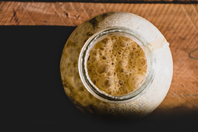
A jar of bubbly sourdough starter viewed from above
A jar of sourdough starter

Sourdough bread is made from fermented (which is why it's sour) dough. The fermentation process takes time, so sourdough makers traditionally use a "starter", which is a fermented mixture of flour and water. A portion of this is taken away (and mixed with other ingredients) when a new loaf is needed, with the rest of the starter forming a standby culture which is regularly "refreshed" with further additions of flour and water.

Different bakers work with different ratios of flour and water comprising their starter and refreshments. This ratio is known in the sourdough trade as "hydration" and is expressed as a percentage calculated by dividing the mass of water by the mass of flour that it is mixed with (and then multiplying by 100).

Different recipes call for different hydrations again, and these can be achieved by altering the relative amounts of flour and water in your dough. This would be easy if everyone started with the same hydration: everyone would need to add the same quantities of flour and water to achieve the same result.

Recipes on the Du's Doughs blog all assume starting from an 80% hydration starter, but blogger Erica has written a post to help those who start with other hydration values to obtain the perfect consistency for each recipe too. Read the post at the link below:

Sourdough Hydration Math

2021/09/20

Lava Lamps and Internet Security

The security of data in our internet-connected world hinges on the generation of very large random numbers. True randomness, however, is next to impossible to achieve, so modern internet security firms work very hard to find ways to generate numbers that seem as random as possible. One such company has found a solution in the form of lava lamps.
A lava lamp is a bottle filled with water and blobs of wax, both brightly coloured. A hot lamp in the base of the lamp heats up the contents of the bottle, melting the wax which gloopily rises, where it cools and falls back to the base before being heated up and rising again. The motion of the wax in the lamp is chaotic, which means that it is very hard to predict.

A row of brightly coloured lava lamps.
Lava Lamps, by Mike Mozart

Internet security company Cloudflare have in their headquarters not just one lava lamp, but one hundred of them. There is a camera constantly watching this wall of chaotic-motion generators. As digital images are stored as a series of numbers describing aspects of each pixel, and each pixel's input is based on a highly chaotic process, this means that each resulting image file does a very good impression of a random number.
Read more about this on Cloudflare's website at the link below:

2021/09/19

Calculating Distance to the Horizon

Navigation Officer Thomas McAuley demonstrates how to calculate the visible distance to the horizon using circle theorems and Pythagoras' theorem.


Watch the video in the player above or click the following link to watch at NCETM's Vimeo account:

Popular Posts

My Blog List

Creative Commons Licencing Information